DikkeBollen
2021
typography, font design


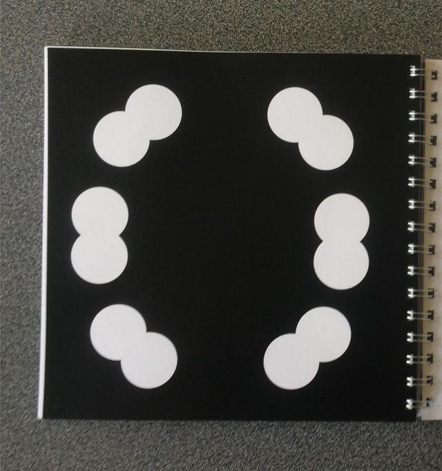
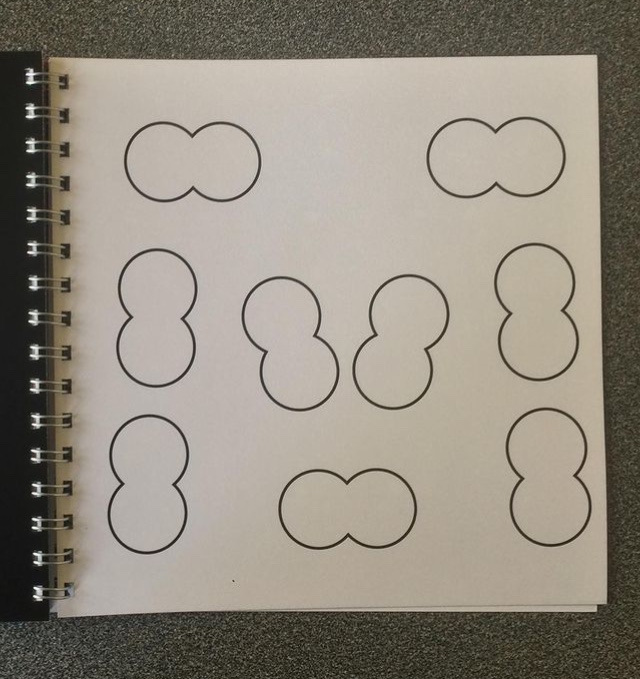
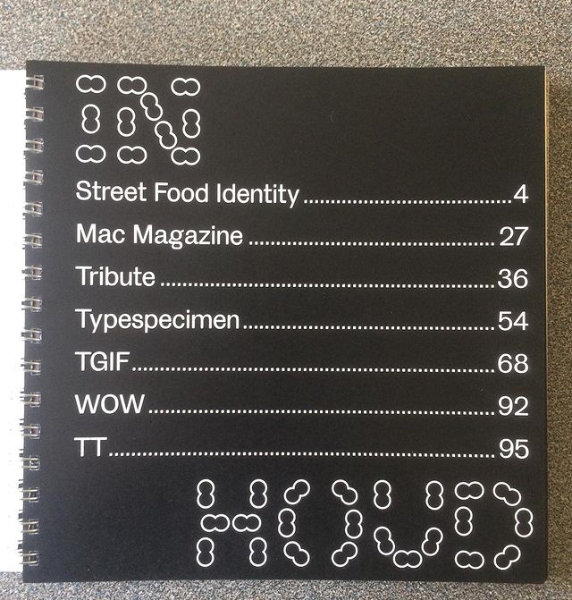
I started making the font "DikkeBollen" for my collection book of the work that I made the second semester
(see photos). For this book I only made a regular version of the font in capitals, to which lower cases were added afterwards.
In the next phase,
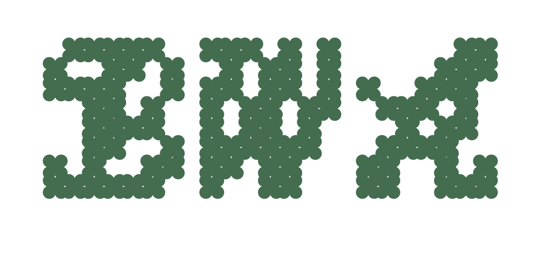
I experimented with the thickness and weight of the letters.
What does a letter need to remain legible?
Which elements are necessary to distinguish a letter from a shape?
And how can we minimalize that number of elements?
I also experimented with other
shapes and made a "Fish" and "VisBlack" version.
The "Vis" version has a more dynamic character
and the "VisBlack" version is very dreamy.
This work is certainly not finished yet and still
has to undergo a lot of rework.


