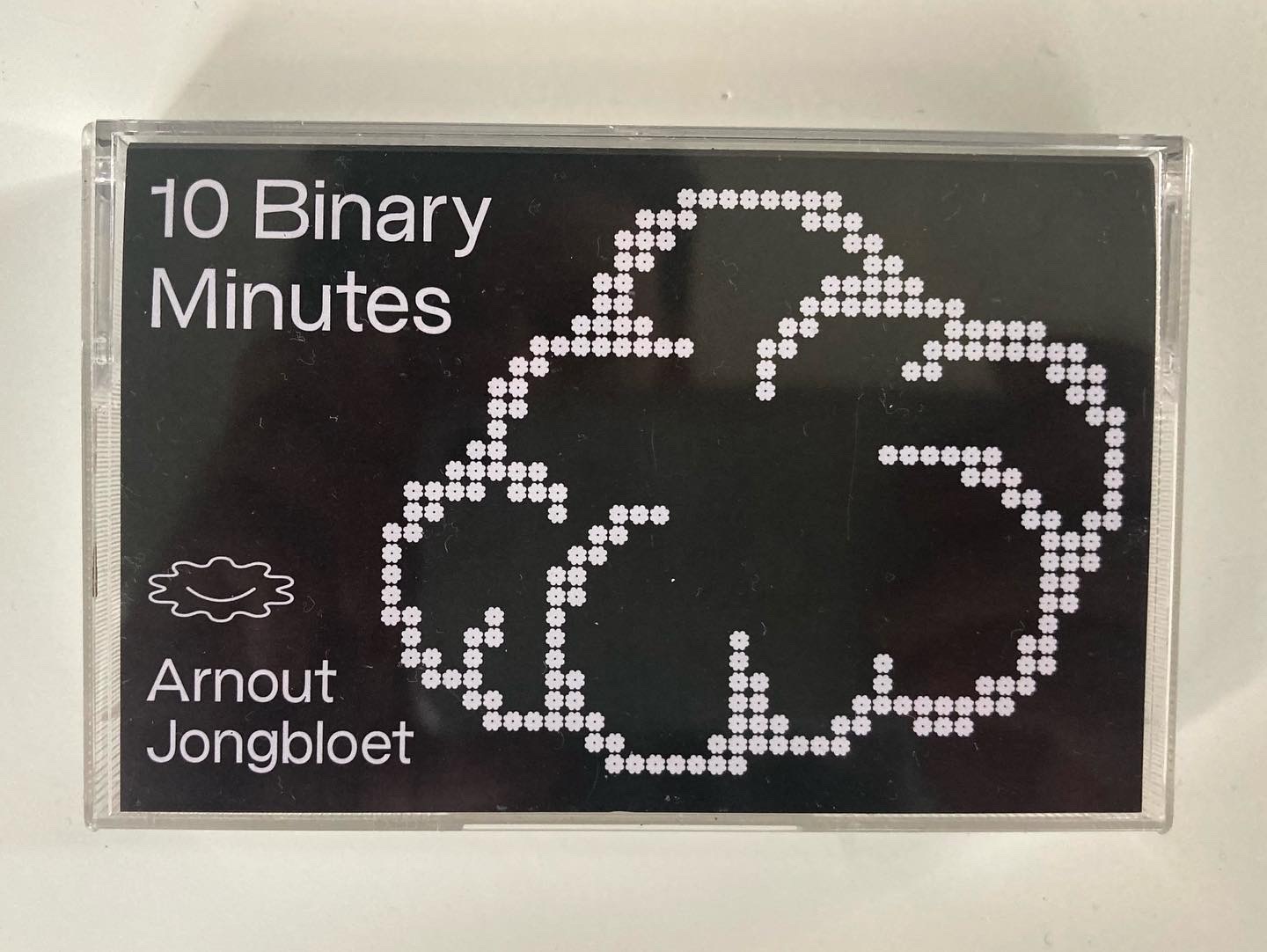
Safe The Night
2022 visual identity, bachelor assignment, gide, safe(r) space

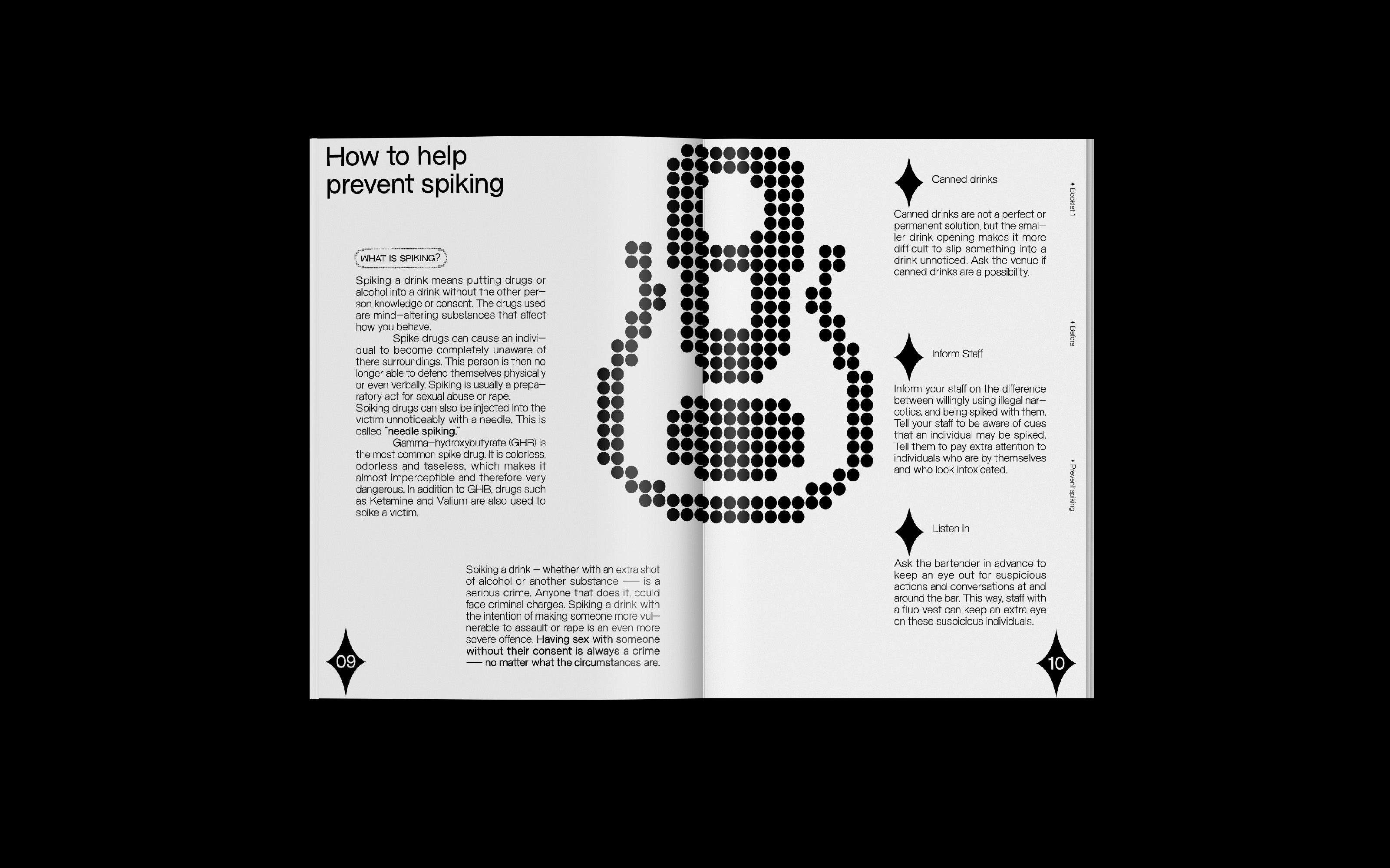


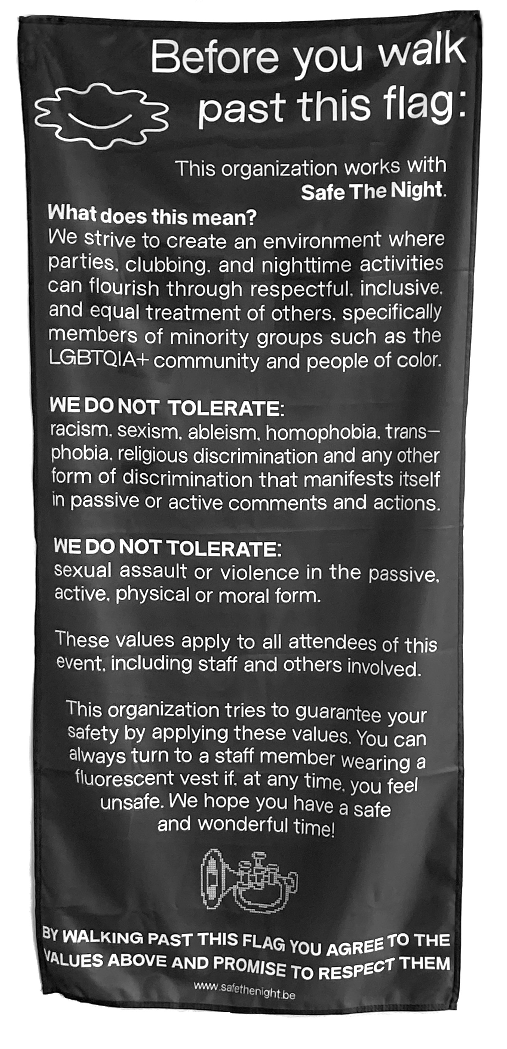
Safe the Night is a toolkit that consists of a guide with attached derivatives to help nightlife organizations achieve a safe(r) space.
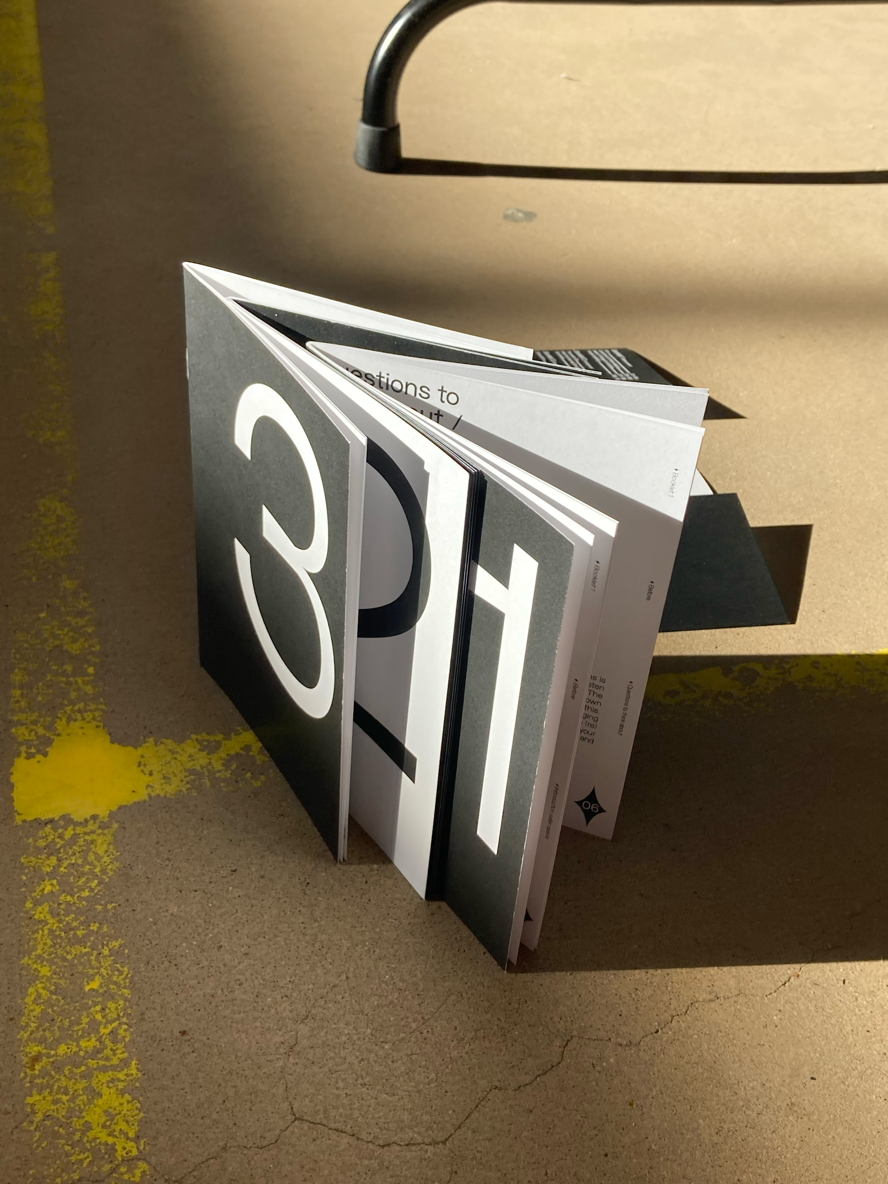
The guide consists of 3 parts: before, during and after an event. Each part helps the organization in its own way to achieve a safe(r) space. Within the guide, reference is always made to the various derivatives in the toolkit that the organization can use.
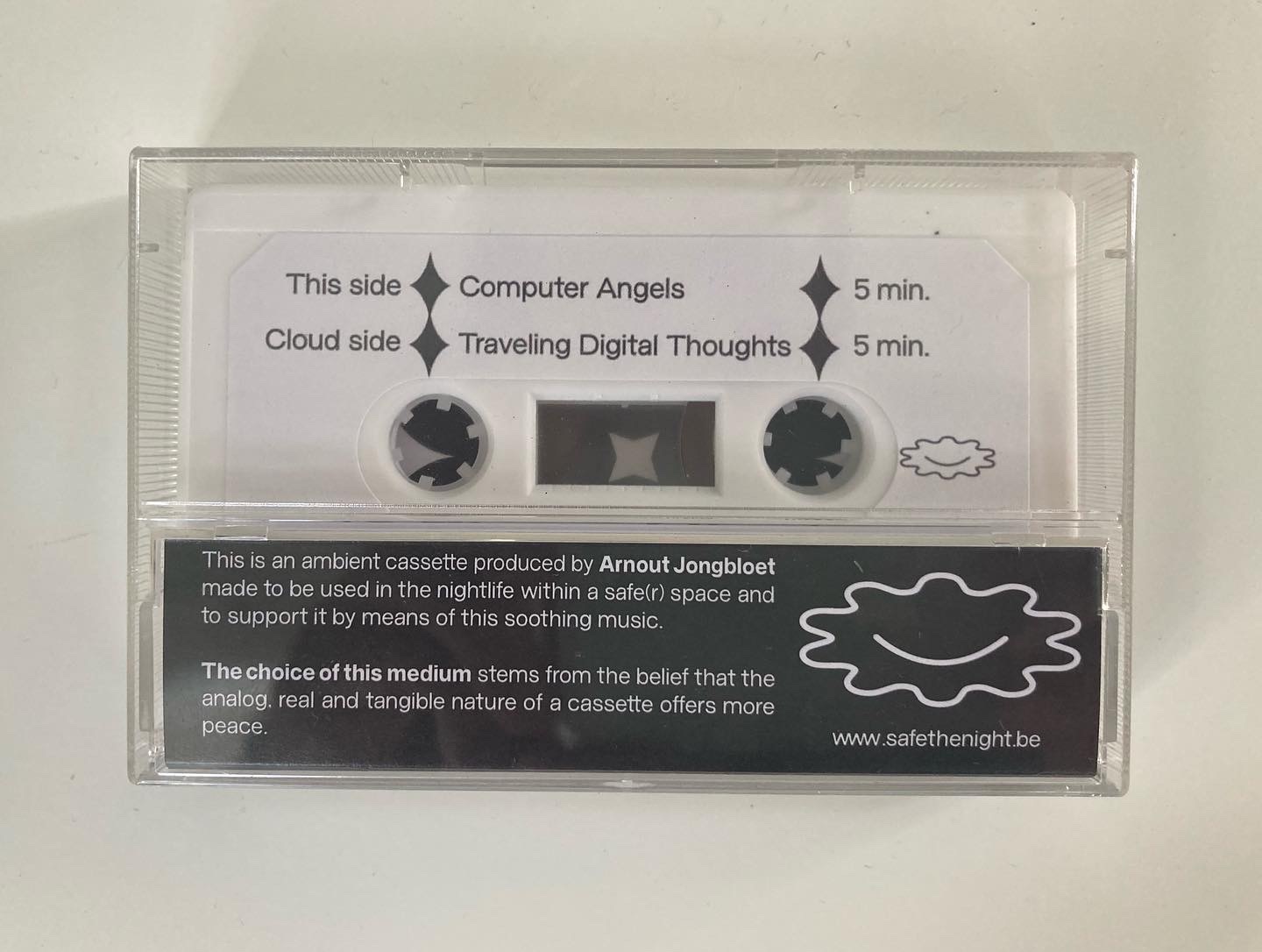
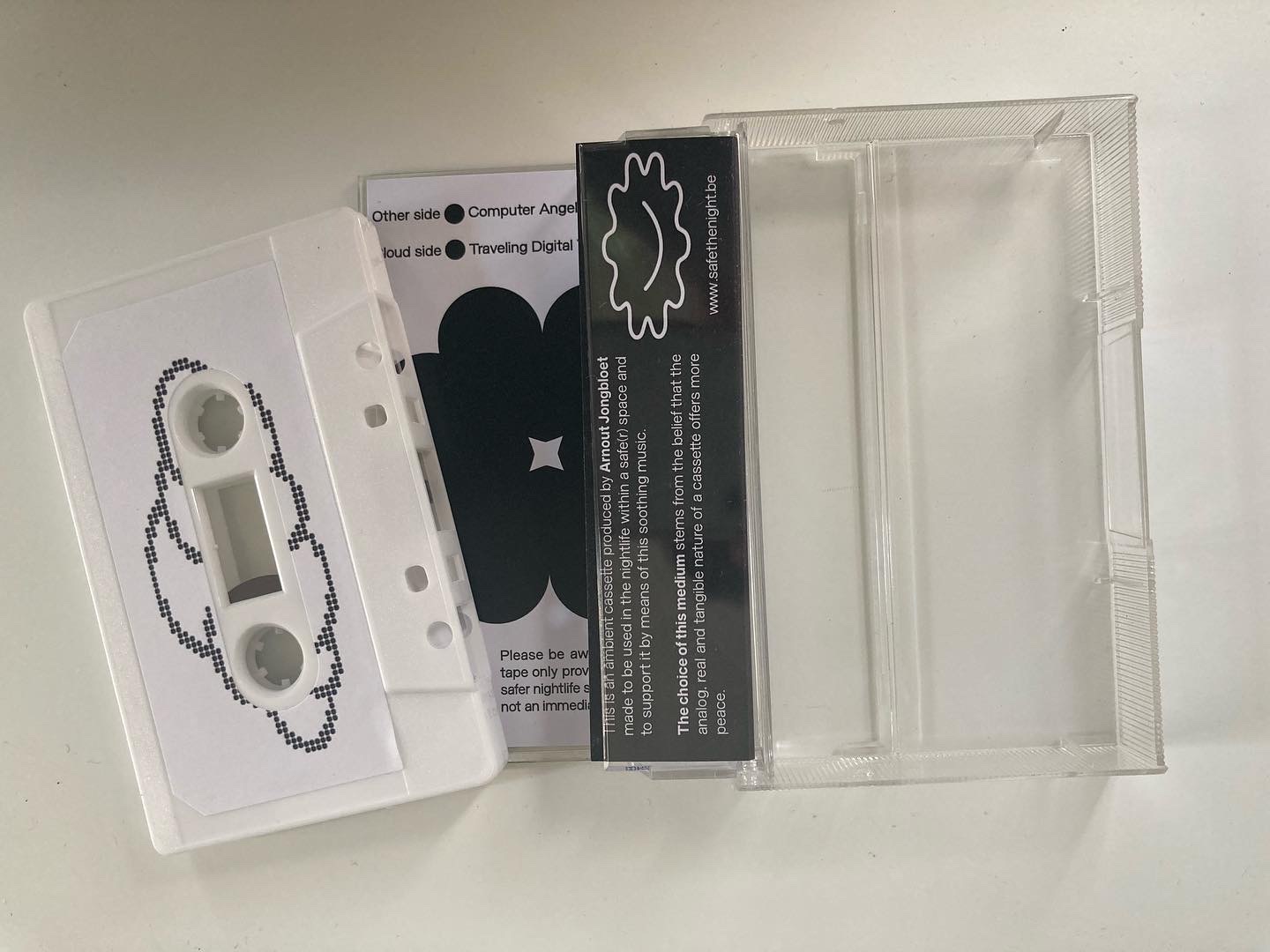
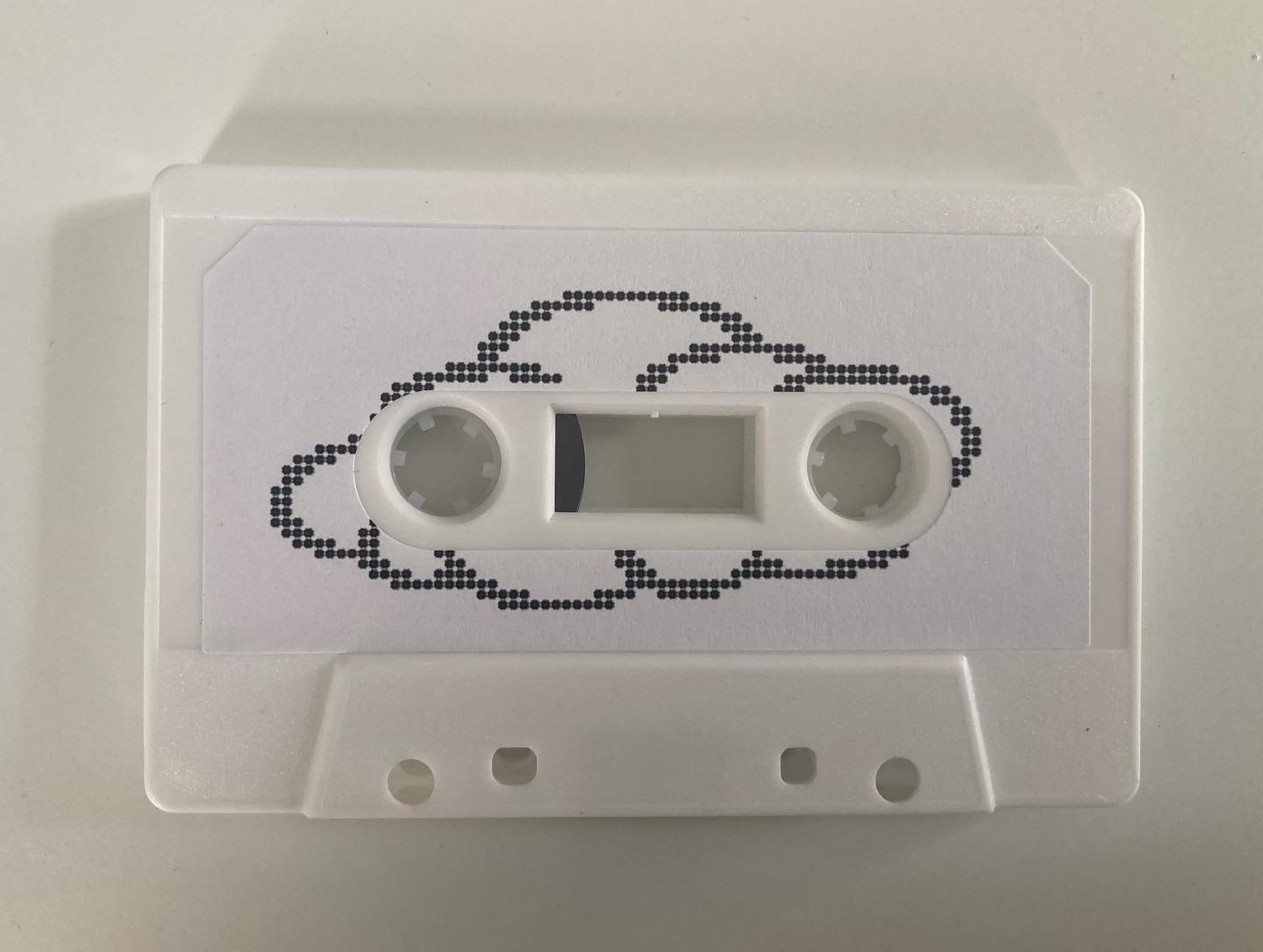
As an example one of the derivatives is an ambient tape that can be played at a party's chill-out zone.
The choice of this medium stems from the belief that the analog, real and tangible nature of a cassette offers more peace and feeling with the immediate environment of the listener.
The tape contains two five-minute tracks that attempt to make digital music more understandable in a critical state.
I see this project as a step in the right direction. The guide can still use many additions and adjustments, so it is certainly not finished yet.
The guide consists of 3 parts: before, during and after an event. Each part helps the organization in its own way to achieve a safe(r) space. Within the guide, reference is always made to the various derivatives in the toolkit that the organization can use.
As an example one of the derivatives is an ambient tape that can be played at a party's chill-out zone.
The choice of this medium stems from the belief that the analog, real and tangible nature of a cassette offers more peace and feeling with the immediate environment of the listener.
The tape contains two five-minute tracks that attempt to make digital music more understandable in a critical state.
I see this project as a step in the right direction. The guide can still use many additions and adjustments, so it is certainly not finished yet.


AM PM
2022
bookdesign, bookbinding, conceptual design
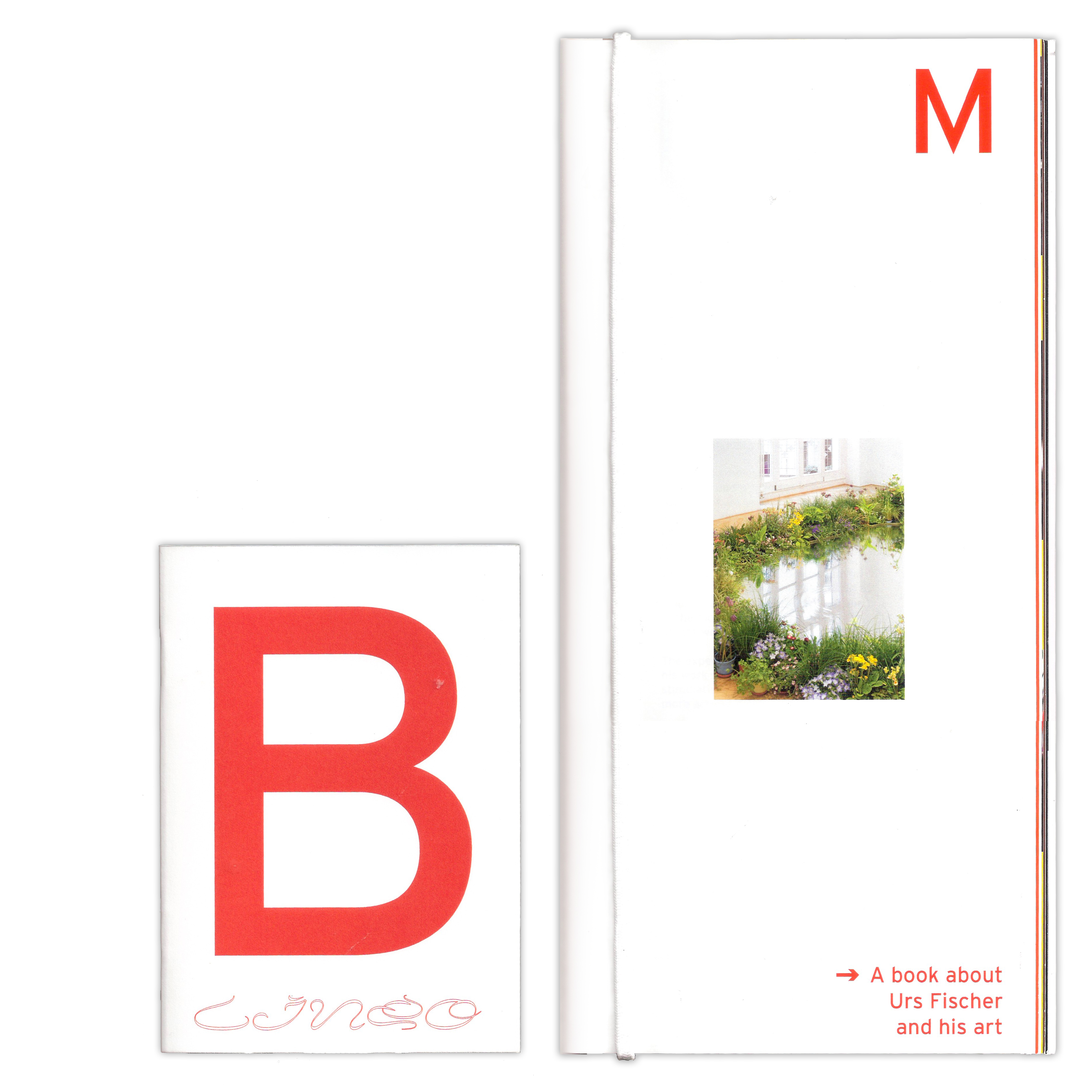


AM PM is a book that integrates work of the modern artist "Urs Fischer" into the world of truck drivers.
The book can be read closed and open.
The closed version explains, acknowledges and recognizes the trucker lifestyle. The fully open version links the outer content to Fischer's art in a visual and playful way.
140x297mm

Affair
2021
visual identity, typography, illustration, animation
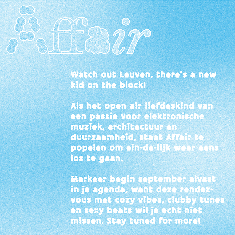


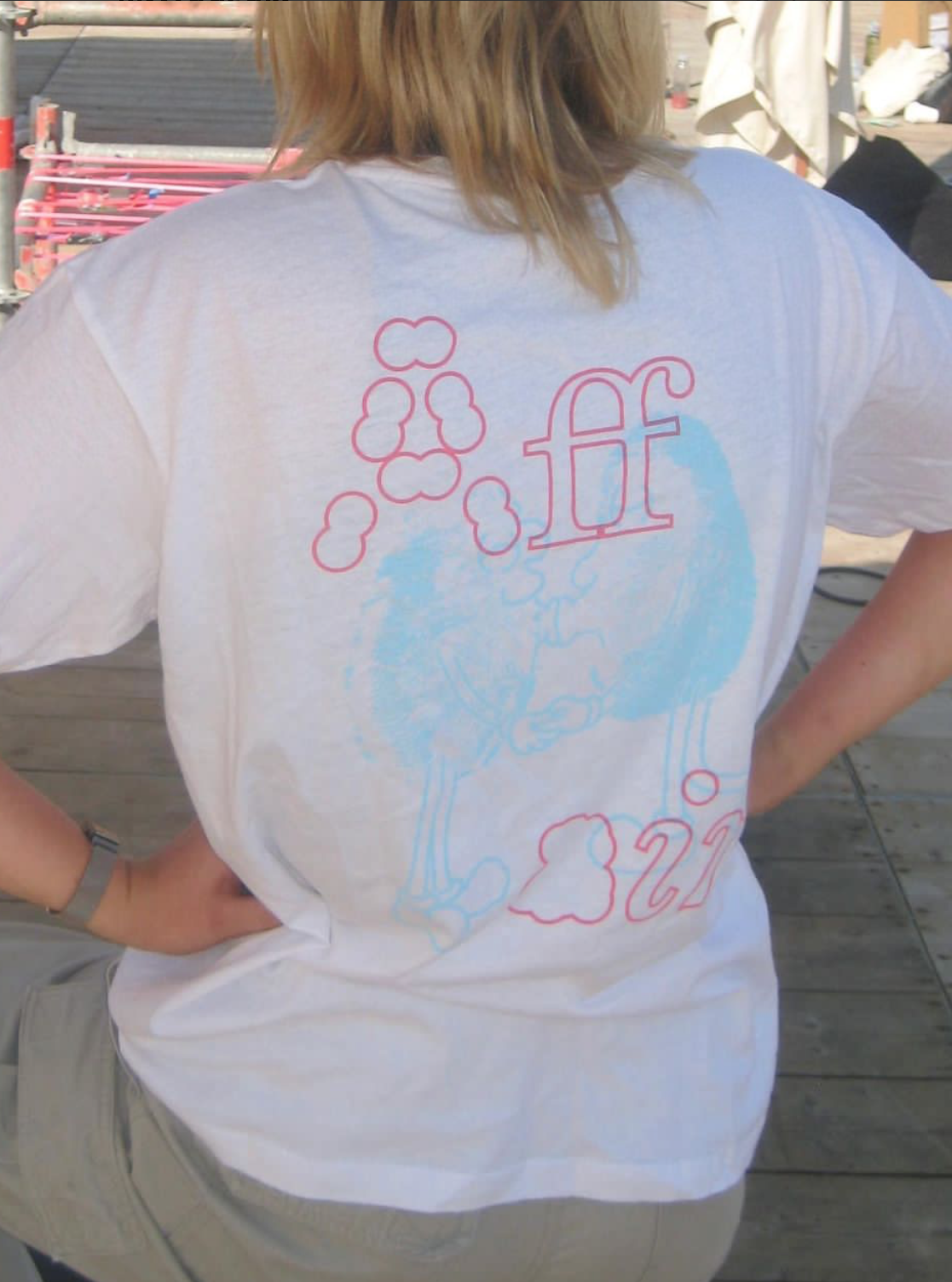

Affair is a leuven based collective that hosts events
around electronic music within a stimulating environment
of scenography and architecture. this collective focuses on love,
physical encounters and the revival of both after the first few lockdowns.
The overall design I created for them is built around tactility.
The visual identity, illustrations and typography were (partly) made by me.
![]()
![]()
![]()
around electronic music within a stimulating environment
of scenography and architecture. this collective focuses on love,
physical encounters and the revival of both after the first few lockdowns.
The overall design I created for them is built around tactility.
The visual identity, illustrations and typography were (partly) made by me.


DikkeBollen
2021
typography, font design

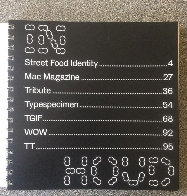


I started making the font "DikkeBollen" for my collection book of the work that I made the second semester
(see photos). For this book I only made a regular version of the font in capitals, to which lower cases were added afterwards.
In the next phase, I experimented with the thickness and weight of the letters.
What does a letter need to remain legible?
Which elements are necessary to distinguish a letter from a shape?
And how can we minimalize that number of elements?
I also experimented with other shapes and made a "Fish" and "VisBlack" version.
The "Vis" version has a more dynamic character and the "VisBlack" version is very dreamy.
This work is certainly not finished yet and still has to undergo a lot of rework.
![]()
![]()
![]()
![]()
![]()
![]()
![]()
![]()
![]()
![]()
![]()
![]()
![]()
![]()
![]()
![]()
![]()
![]()
![]()
![]()
![]()
![]()
![]()
![]()
![]()
![]()
![]()
![]()
![]()
![]()
![]()
![]()
![]()
![]()
![]()
![]()
![]()
![]()
![]()
![]()
![]()
![]()
![]()
![]()
![]()
![]()
![]()
![]()
![]()
![]()
![]()
![]()
![]()
![]()
![]()
![]()
![]()
![]()
![]()
![]()
![]()
![]()
![]()
![]()
![]()
![]()
![]()
![]()
![]()
![]()
![]()
![]()
![]()
![]()
![]()
![]()
![]()
![]()
![]()
![]()
![]()
![]()
![]()
![]()
![]()
![]()
![]()
![]()
![]()
![]()
![]()
![]()
![]()
![]()
![]()
![]()
![]()
![]()
![]()
![]()
![]()
![]()
![]()
![]()
![]()
![]()
![]()
![]()
![]()
![]()
![]()
![]()
![]()
![]()
![]()
![]()
![]()
![]()
![]()
![]()
![]()
![]()
![]()
![]()
![]()
![]()
![]()
![]()
![]()
![]()
![]()
![]()
![]()
![]()
![]()
![]()
![]()
![]()
![]()
![]()
![]()
![]()
![]()
![]()
![]()
![]()
![]()
![]()
![]()
![]()
![]()
![]()
![]()
![]()
![]()
![]()
![]()
![]()
![]()
![]()
![]()
![]()
![]()
![]()
![]()
![]()
![]()
![]()
![]()
![]()
![]()
![]()
![]()
![]()
![]()
![]()
![]()
![]()
![]()
![]()
![]()
![]()
![]()
![]()
![]()
![]()
![]()
![]()
![]()
![]()
![]()
![]()
![]()
![]()
![]()
![]()
![]()
![]()
![]()
![]()
![]()
![]()
![]()
![]()
![]()
![]()
![]()
![]()
![]()
![]()
![]()
![]()
![]()
![]()
![]()
![]()
![]()
![]()
![]()
![]()
![]()
![]()
![]()
![]()
![]()
![]()
![]()
![]()
![]()
![]()
![]()
![]()
![]()
![]()
![]()
![]()
![]()
![]()
![]()
![]()
![]()
![]()
![]()
![]()
![]()
![]()
![]()
![]()
(see photos). For this book I only made a regular version of the font in capitals, to which lower cases were added afterwards.
In the next phase, I experimented with the thickness and weight of the letters.
What does a letter need to remain legible?
Which elements are necessary to distinguish a letter from a shape?
And how can we minimalize that number of elements?
I also experimented with other shapes and made a "Fish" and "VisBlack" version.
The "Vis" version has a more dynamic character and the "VisBlack" version is very dreamy.
This work is certainly not finished yet and still has to undergo a lot of rework.


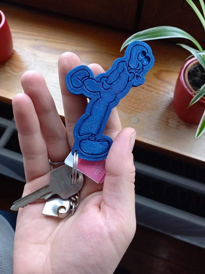
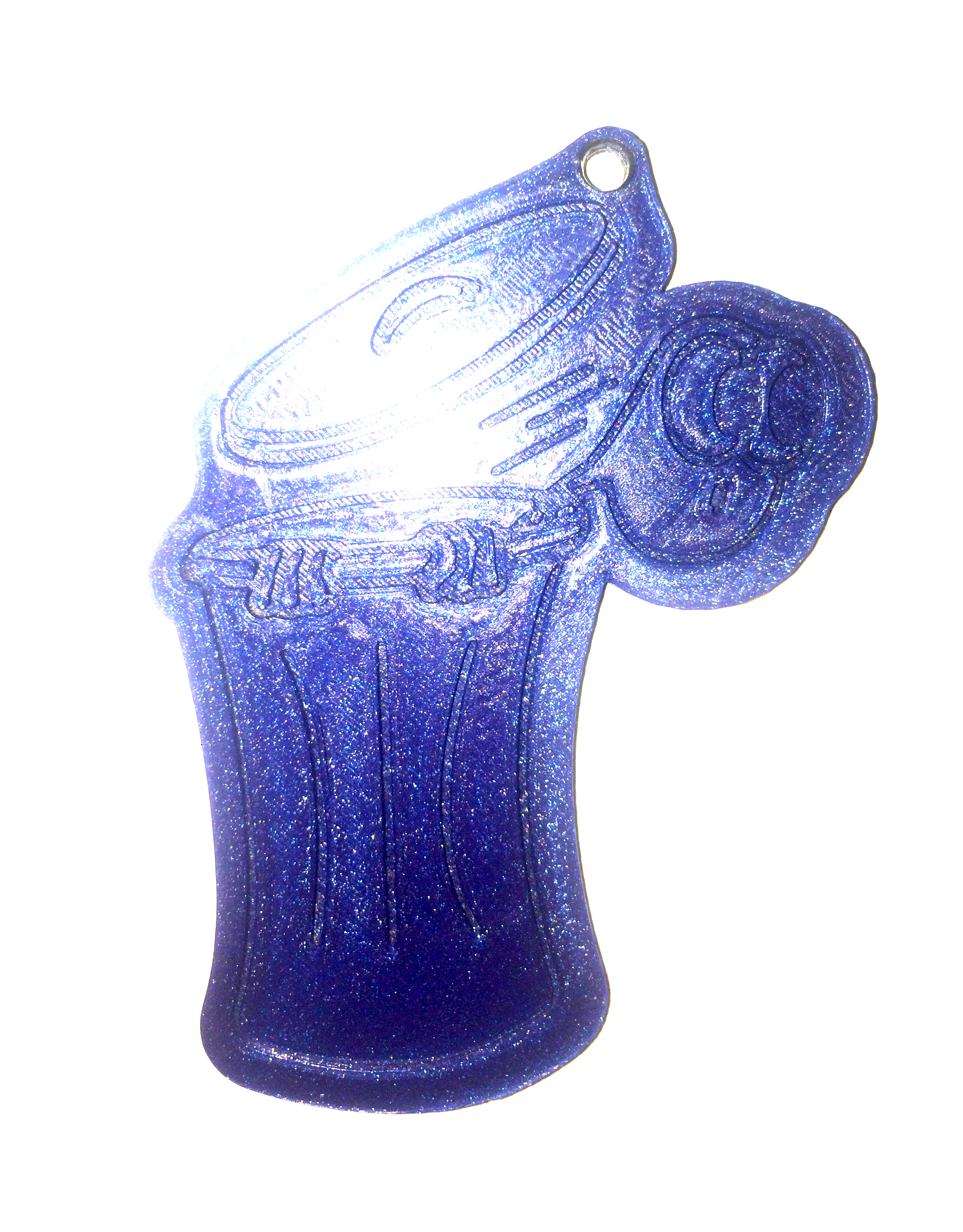
Keychains
2021
illustration and 3D printing